Graphic design
Logo Design
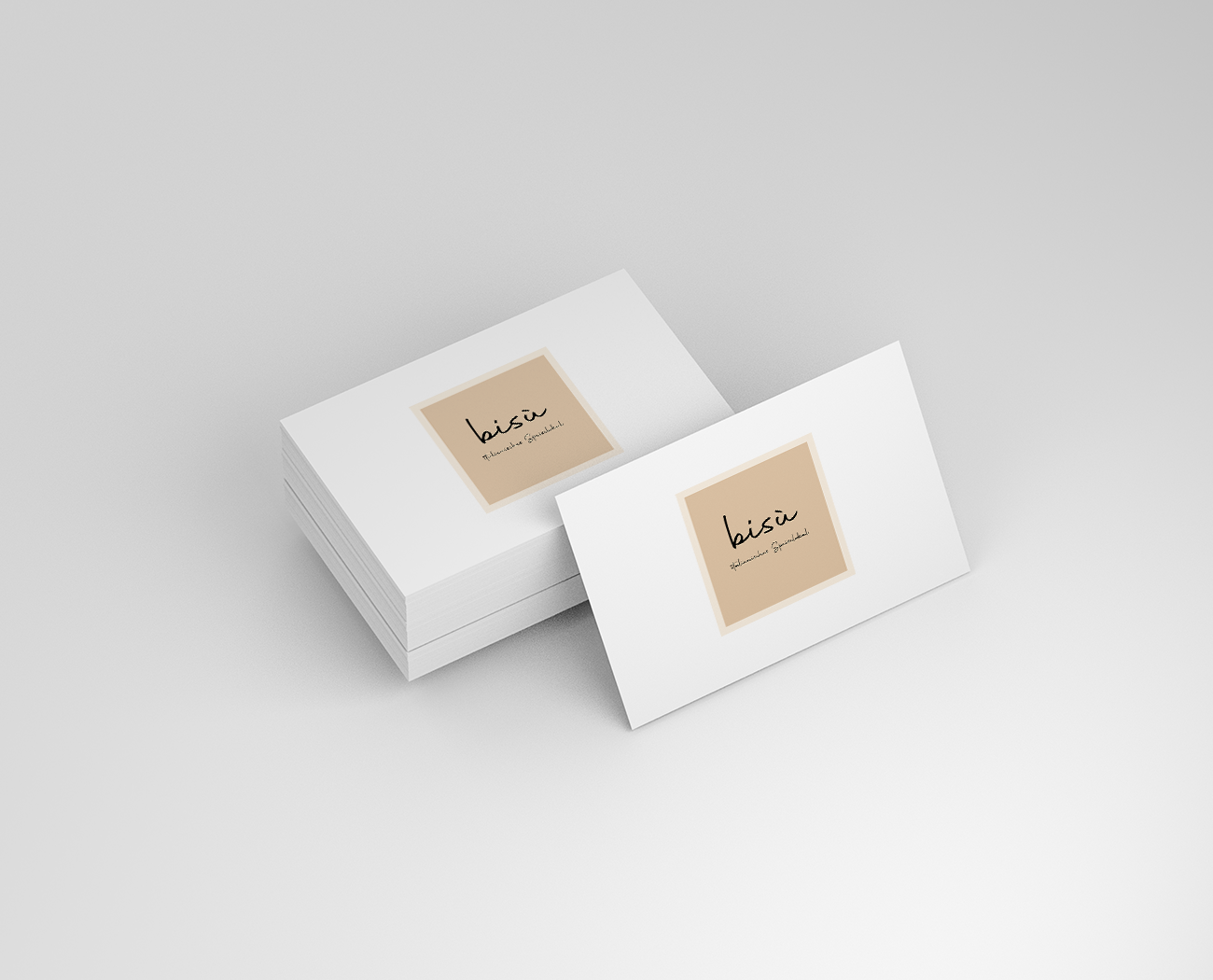
As a media designer, it was a pleasure for me to design the logo for Bisù. When creating the logo, it was important for us to emphasize the authenticity of the project while adding a modern touch.
The restaurant offers traditional Italian cuisine in the form of small portions like tapas. The name Bisù, which means „little things“ in the northern Italian dialect, fits perfectly with this idea and serves as inspiration for the logo.
We deliberately chose warm colors like terracotta and cream to represent traditional Italy while creating a welcoming and cozy atmosphere. The typeface of the logo is plain and simple, reflecting the authenticity of the project.
Distinctively reintermediate.
For the design of the logo, we chose a round shape to emphasize the concept of small portions. In the center of the logo we placed a circle symbolizing the heart of the restaurant – the kitchen. Around it are small elements reminiscent of Italian culture and traditions.
The logo is an important part of the Bisù brand and plays a central role in creating the look of the restaurant. It is not just an image, but tells a story and conveys the restaurant’s message.
As a media designer, I am proud to be involved in this project and look forward to showcasing the logo in various media – from the menu to the website and social media channels.


